Comparisons are never fair, and are considered to be of bad taste. However, we still compare things all the time. In the world of soccer comparisons between Messi vs Ronaldo, or Messi vs Maradona happen daily among diverse platforms. In the discussions we compare players and use metrics such as goals, assists, silverwear earned or even contract sizes as ways to quantify which player is ‘better’. Most of the times we compare players in the same filed position but as team tactics evolve, it becomes hard to find two players developing the same role. For example, a 9 may act as a ‘poacher’, a fake-nine or a combination of other positions.
In this post I’m proposing a method to identify which players can be compared to each other based on their field positioning. To keep this simple I will compare only players’ heatmaps. The control in here will be the greatest striker to bless this Earth…. Javier “Chicharito” Hernandez (aka Chichadios). In other words, I will discover which players move around the same areas as Hernandez and thus, which player stats can be ‘fairly’ compared to those of Herandez.
I will compare players’ club heatmaps during the 2016-2017 season to see which players can be ‘fairly’ compared to Hernandez. I will then build a Convouted Neural Network (CNN) to process the images and learn to read a heatmap and predict which player it belongs to.
The Analysis
I first collected heatmaps from players from WhoScored.com. This was a painful task as data is expensive and sites usually create a myriad of roadblocks to prevent people from scraping their site.
Players included in this analysis are:
- Mario Madzukic
- Robert Lewandoski
- Edinson Cavani
- Zlatan Ibrahimovich
- Romelu Lukaku
- Gonzalo Higuain
- Luis Suarez
- Marco Verratti
- Kylian Mbappe
- Radamel Falcao
- Paulo Dybala
Next I constructed a CNN for categorical data. Once the CNN is trained and cross-validated, I then fed a series of heatmaps of Herandez. The output was a list with the probabilities of the heatmap belonging to a player studied in the CNN.
Results
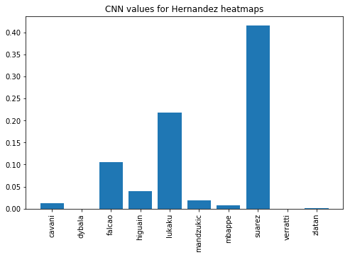
As we can see in this graph, Hernandez’ heatmaps look very similar to Suarez’ heatmaps. Notice the value is close to .40, meaning we’re 40% sure the heatmaps will belong to those of Suarez. Also note the values for Verratti and Dybala. I am aware they are not strikers, and they move more around midfield. As expected the model gave low values for those two lads.

The charts below plot the average heatmap of each of the top 3 ranked players by the model and puts them next to the average of Hernandez. A simple glance will agree with the results of the model. Suarez and Hernadez produce similar movements!


Now, I must come clean… I used one season worth of data per player. Injuries, or manager decisions could have prevented the player to start a game which reduced my sample set. Overall, I was able to train my CNN with around 25 heatmaps per player. This was enough to produce a reasonable output, but in order to increase the accuracy and confidence I would have to retrain the network with around 100 heatmaps per player.
Source of heatmaps: www.whoscored.com
Footnote for those Curious
CNN Settings
%matplotlib inline
train_datagen = ImageDataGenerator(
        rescale=1./255,
        shear_range=0.2,
        zoom_range=0.2,
        horizontal_flip=True,
        )

test_datagen = ImageDataGenerator(rescale=1./255)

training_set = train_datagen.flow_from_directory(
        'Soccer_Heatmaps/dataset/training_set',
        target_size=(64, 64),
        #target_size=(300, 200),
        batch_size=32,
        class_mode='categorical',
        shuffle=False)

test_set = test_datagen.flow_from_directory(
        'Soccer_Heatmaps/dataset/test_set',
        target_size=(64, 64),
        #target_size=(300, 200),
        batch_size=32,
        class_mode='categorical')

classifier.fit_generator(
        training_set,
        steps_per_epoch=10,
        epochs=10000, #Yes, this took forever!
        verbose=2,
        validation_data=test_set,
        validation_steps=1)